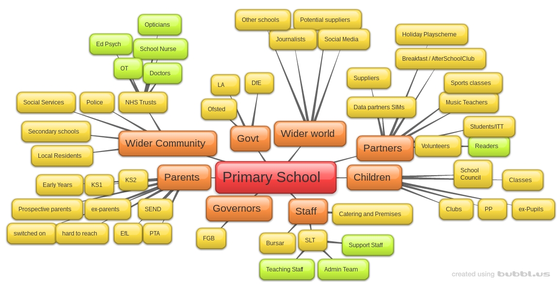
 I’ve been trying to map the communications at the school I’m governor at, in order to help understand how we can improve this aspect of the school strategic direction. I’ve already posted on how terrible most school communication is, and part of the problem is that it is rare for schools to look at this as a distinct part of their work.
It has been quite a shock to note how complex it all is, so I’ve created a few images to help discuss our plans. I’d love feedback on these and hope that they might prove useful to other governors and school leaders. These images were created using Bubbl.us which is a quick and colourful tool for mindmapping. I’d love to see examples or suggestions of how to improve the presentation of this information, but these are a first draft, so forgive my visual ineptitude.
This first map is an attempt to capture the possible audiences for school communication. It is not a complete picture, and the last few nodes are examples to aid discussion. We hope to start crafting messaging that is more appropriate to each audience; in terms of the content, timing and method.
This map is an attempt to look at all the ways schools interact with the world. Again, the last nodes are not a complete list but an indicative example. We are hoping to match the right channels to the right audience, and ensure that, as governors, we can quickly review the operational decisions of SLT to improve communication in specific strategic areas. That is going to take time – but we hope these tools will help us
I hope these are of some use to you, as they are part of our journey to improve school communication. I will carry on sharing as we go, of course.


Pingback: School Communication under the microscope | Eylan Ezekiel